


KidiHome is an adventurous hybrid game for kids that encourages quality family time in home environment
l
Project overview
l
Problem
Due to technological developments, there has been a decrease in family time between parents and children (aged 5-7) in Dutch households. The lack of family time contributes to children having difficulties adapting to complex social situations.
My role & responsibility
UX and UI designer
User researcher
Goal
We aimed to stimulate quality family time on a daily basis while giving young users a sense of accomplishment and offering customisation to fit all types of families.
Project duration
4 months
l
User research
l
Stakeholders and their values
Through various user-focused approaches, our team could assemble the context of this project and envision what is required through this product.

From the list of stakeholders we could derive some requirements of this product based on their needs and concerns. Furthermore, we examined different family types and thought of which of their characteristics and values would resonate with our product.


We were able to gain some insights from conducting competition map analysis and assessing similar products that are already in the market. For instance, the games that are most suitable for families tend to be simple and owns many familiar aspects.
Personas
Creating personas of different user types and envisioning their daily routines inspired us to inspect the overlooked areas in the behaviors, goals and needs of our target users.


l
Ideation & Sketches
l

We started off by generating ideas with various criteria in mind that we have produced through research such as ‘how can the game create the feeling of accomplishment’.


Through multiple courses of diverging and converging, we were able to explore many new possibilities. They were then evaluated and merged to develop the ideas into a more solid concept.
Ideation methods
%20ideas%20-2.png)
%20ideas%20-3.png)


The concluding concept we landed on was a combination of physical product and a phone app. Each element of the concept was attentively explored and different solutions were considered. Examples being the selection method of the tile or the form of the product.
%20ideas%20-1.png)

l
UX UI design development
l
Wireframing
We first established the structure of how the app and the product would simultaneously concomitant and generated some wire frames accordingly. This process assisted our following design journey providing guidance regardless the stage we were in.


UI Ideation & User testing
Different themes of UI as well as the avatars and the font types were tested to gain insights from the opinions of the actual target group, the children.
The testing environments were not entirely adequate to the ideal situation of how we wanted the product to be used (as this was to be used in home setting with families, but we got hold of a group of children from daycare), so some adaptations were made to fit the given circumstances. Nonetheless, we were able to make improvements in the design based on the feedback we were given and from making observation and analyzing their behaviors.


We determined to reserve the design style of Kidiyo as much as possible for brand image, using the same color palette for instance.
As we were designing for children, we followed the children design principles such as incorporating more symbols and images and less texts, or using higher contrast.
l
l
Product design development
Product features ideation
The physical product was regarded to counterpart and corresponds to the function of the app. A good few of the attributes were later tried out in the prototyping stage.
.jpg)
.jpg)
Product prototyping


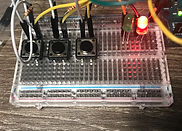


Through prototyping we could experiment with different features and characteristics of the whole user experience. What is expected from the children side and their parents had to be deliberately considered. Below is the last prototype that we have manufactured with wood for the final user testing.
The later steps of conceptualization were continued with fusion 360.


Customization


Each child gets the freedom to customize their own character to their liking.
As children build attachment to their characters, it can inspire them to take more initiative throughout the process.
l
Presentations & Final Thoughts
l


These are the flyer and poster that I have designed for presenting this concept at design expos. The function of the concept are displayed step by step.
This hybrid product required our team extra perspectives to look into details and each stage for the smooth user experience. It genuinely reappraised us the importance of flow chart and structural outlining when dealing with complex service. Furthermore, designing for children emphasized the attention to characteristics of the users for us and it was a good practice for us to be more resourceful managing unfamiliar target group.